Attack of the Show preview:
Via Engadget.
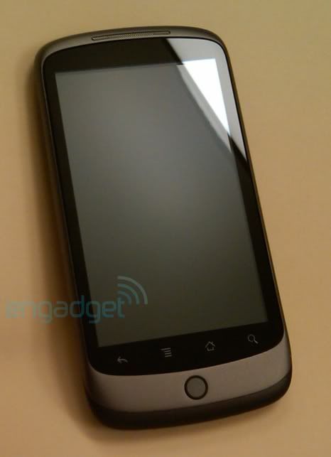
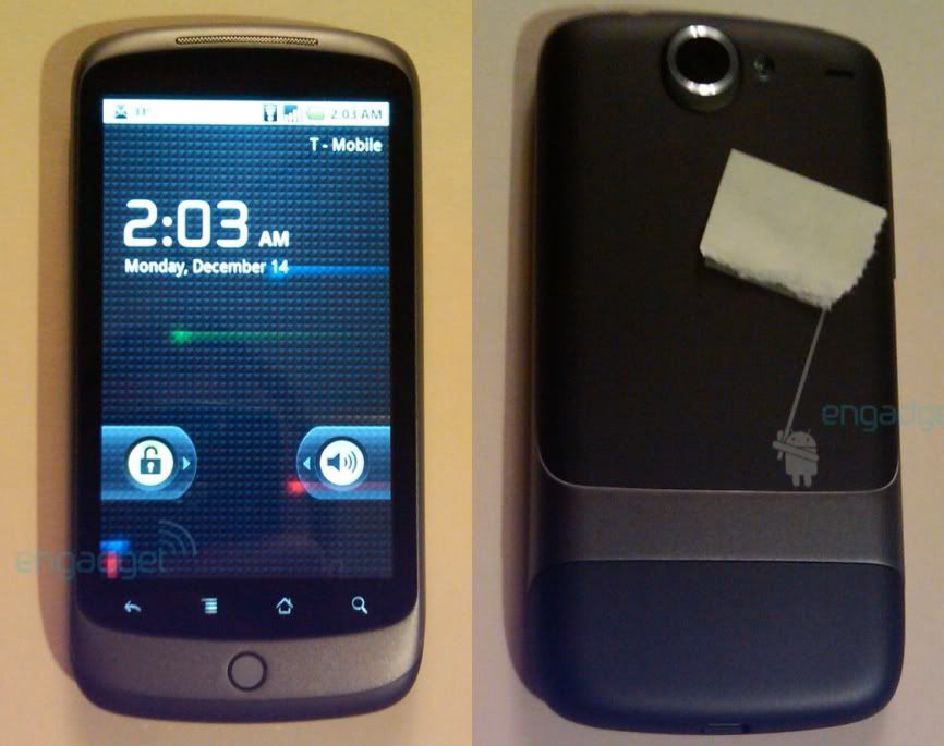
Well here you have it folks, honest-to-goodness pics of the Google Phone... AKA, the Nexus One. As you can see by the photos, the design of the device is largely similar to those we've seen, but the graphic on back is slightly different, and that piece of tape is covering a QR code (how very Google of them). Just like we've heard before, the updated OS features new 3D elements to the app tray, as well as an extended amount of homescreens, though it looks like the lock screen / mute is the same as in Android 2.0.1. Additionally, there's now a new grid icon at the bottom of the homescreen, which when pressed brings up a webOS card-style preview of all homescreen pages -- which raises some interesting possibilities. Apparently there's been a new software update for the device pushed tonight, and sure enough the phone is identified as the Nexus One on the system info page. Quite clearly this device is running on T-Mobile, and is also using WiFi, so there's two other questions you've got answers to. The phone also appears to come loaded up with Google Navigation (a bit of a no-brainer) and the brand-spanking-new Google Goggles. Hardware wise, the Nexus does look incredibly thin and sleek, and while there's not a slew of buttons (those four up front are clearly touch sensitive), there is a dedicated volume rocker along the side. Oh, and note this... no HTC logo anywhere to be found.
Update: One item of interest. In the packaging there's a quick start guide which points users to a "questions" page at google.com/phone/support. The page is a dead end right now, but it certainly gets an eyebrow raise from us. If there is a real Google Phone in the offing, that seems a likely landing page for support.
Update 2: In case you're interested, here's Android 2.1's boot animation for Nexus One. Eerily familiar, no?


1 comment:
Sexy, sexy phone!
Post a Comment